“Fancy Blossoms” becomes a hit! Lu Xun, the first master of graphic design in the Republic of China! Includes free commercial use “Zhu Lang Meng Ya” font
Recently, the TV series “Fancy Blossoms” directed by Wong Kar-wai has sparked widespread attention and discussion. This TV drama, which reflects Shanghai in the 1990s, has been highly acclaimed for its unique artistic style and exquisite production. I was attracted by the font design of the title “Fancy Blossoms” and upon further investigation, discovered that this font has a remarkable background.

Zoomlamengyas 01
The “Zhu Lang Meng Ya” font has distinctive characteristics. Its lines feature a pattern of square exterior and round interior, where sharp outer angles and triangular components complement each other, while the internal space presents a circular cutting effect. This fully embodies the exploration and innovation of Chinese characters by the cultural elite during the May Fourth Movement and the late Qing Dynasty and early Republic of China period, under the influence of industrialization thinking. The sharp and angular components of this font endow it with progressive, revolutionary, and aggressive traits.
“Meng Ya Monthly” edited and designed by Lu Xun, published by Guanghua Bookstore in January 1930
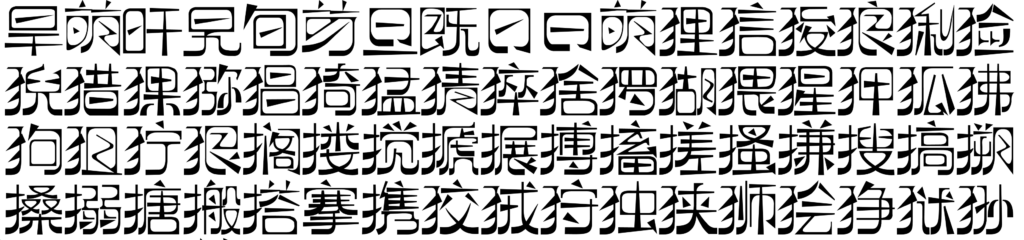
Zoomlamengyas 02
The font design refers to the January 1930 edition of “Meng Ya Monthly”Characteristics: square exterior, round interior, slightly flattened structure, sharp outer components, and circular internal space
Number of characters: 6763 Chinese characters License agreement: SIL Open Font License 1.1
Sources: Beijing Institute of Fashion Technology, Zhu Lang Font Library
The “Zhu Lang Meng Ya” font possesses the following characteristics:
Sharp angles are used for outer corners, while curved shapes are used for inner corners, creating a unique contrasting effect.
It is an abstract curved font, full of artistic sense.
It attempts to reproduce the handwritten font style of the “Leftist Alliance” in the 1930s, a style commonly used in publications that is minimalist yet artistic.
The font includes rich and varied curved and triangular elements.
Overall, it presents a squat, wide, and square shape, while also containing many unconventional and irregular characters.
There is a significant contrast between the thickness of strokes, with the strokes of angles thicker than horizontal and vertical lines.
The lower end of vertical strokes is thicker than the upper end, while the left side of horizontal strokes is thicker than the right side.
The outer corners are predominantly square in design, while the inner corners lean towards a circular shape, showcasing creativity.